chani - onboarding

Ipads screens showing the different tabs of the easydesk app

01

Chani

2025

Overview

Overview

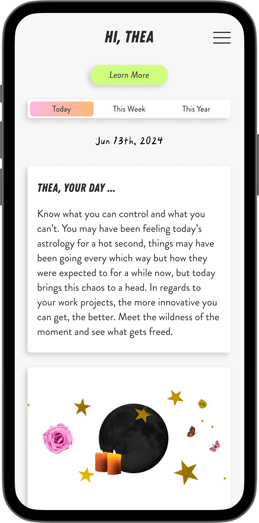
When I joined CHANI as Product Designer, the app had no formal onboarding flow. New users were dropped straight into a content-heavy astrology experience with little guidance.

I was tasked with designing an onboarding system from the ground up: one that would set new users up for success, reduce the burden on our customer experience team, and make the value of CHANI immediately clear.

Over four months, I led end-to-end research, design, and cross-functional collaboration to ship a three-pronged continuous onboarding solution. The results surpassed expectations.

GOALS

  • Reduce user drop-off and Customer Experience help desk volume by clarifying the app experience upfront.

  • Communicate free vs. premium content clearly to new users.

  • Build a guided, contextual onboarding system that scales with the app over time.

Role:

Role:

End to End product design

End to End product design

design systems

design systems

user research

user research

Timeline:

Timeline:

Q4 2024 + Q1 2025

Q4 2024 + Q1 2025

With:

With:

engineering dept.

engineering dept.

Product dept.

Product dept.

Customer experience dept..

Customer experience dept.

the challenge

the challenge

CHANI is a content-heavy app built around astrology, a subject that comes with its own terminology, systems, and learning curve. For new users, this created an immediate barrier. Without any onboarding infrastructure, users were left to figure out the app on their own, and many didn't get far.

And the problem wasn't just a UX gap, it was a business one too. Our CX team was fielding a high volume of support requests for issues that better design could solve. Plus we didn't have email verification so our marketing and recovery capabilities were severely limited.

Business need: Reduce CX overhead, improve email verification rates, and remove friction from the sign-up funnel to support growth.

USEr need: Help new users understand what CHANI offers, navigate a complex app confidently, and feel supported from the moment they sign up.

USEr need: Help new users understand what CHANI offers, navigate a complex app confidently, and feel supported from the moment they sign up.

problem to solve

Users were dropping off and flooding support channels because CHANI offered no guidance, leaving new users confused about the app's value, unsure what was free vs. premium, and without the tools to recover their accounts.

Users were dropping off and flooding support channels because CHANI offered no guidance, leaving new users confused about the app's value, unsure what was free vs. premium, and without the tools to recover their accounts.

the research

understanding the problem

understanding the problem

Digging into Customer Support help desk tickets and a 500-person user survey uncovered a clear pattern: users weren't leaving because they didn't like CHANI, they were leaving because they didn't understand it. Those findings drove every design decision, from email verification to informational easter eggs. Our focus was on meeting users with the right information at exactly the right moment.

Digging into Customer Support help desk tickets and a 500-person user survey uncovered a clear pattern: users weren't leaving because they didn't like CHANI, they were leaving because they didn't understand it. Those findings drove every design decision, from email verification to informational easter eggs. Our focus was on meeting users with the right information at exactly the right moment.

customer experience audit

customer experience audit

My first step was sitting down with our customer experience team and combing through their help desk tickets. What I found was eye-opening. A large volume of requests centered around issues that were entirely preventable with better UX. Together, we grouped the tickets into five main categories:

Account recovery: Without email verification, users who forgot their passwords had almost no way to recover their accounts.

Account recovery: Without email verification, users who forgot their passwords had almost no way to recover their accounts.

Free vs. premium confusion: Users had no clear understanding of what content required a subscription and what was available for free.

Free vs. premium confusion: Users had no clear understanding of what content required a subscription and what was available for free.

astrology system clarity: Many users were confused about which system CHANI used (Whole Sign Houses, Rising Sign for transits) — a foundational question that affected how they interpreted their charts.

astrology system clarity: Many users were confused about which system CHANI used (Whole Sign Houses, Rising Sign for transits) — a foundational question that affected how they interpreted their charts.

birth time uncertainty: Users weren't sure what to do if they didn't have accurate birth time information, causing friction right at the start of setup.

birth time uncertainty: Users weren't sure what to do if they didn't have accurate birth time information, causing friction right at the start of setup.

feature navigation: Users struggled to find and use key features without any contextual guidance.

feature navigation: Users struggled to find and use key features without any contextual guidance.

user survey & affinity mapping

user survey & affinity mapping

To hear directly from users, I designed and launched a survey via Google Forms. Over two months, we collected around 500 responses. I reviewed each one individually and categorized them into themes using affinity mapping. The most consistent themes that emerged were:

A desire for education around astrology concepts and terminology

A desire for education around astrology concepts and terminology

Confusion around how to use specific app features

Confusion around how to use specific app features

Frustration with not knowing what was included in their subscription

Frustration with not knowing what was included in their subscription

These survey insights reinforced what the CX audit had surfaced, and gave me the confidence to move forward with a comprehensive onboarding redesign rather than a series of small patches.

These survey insights reinforced what the CX audit had surfaced, and gave me the confidence to move forward with a comprehensive onboarding redesign rather than a series of small patches.

key insights & themes

key insights & themes

These insights drove our prioritization of features and ensured with kept sight of our business and user needs.

These insights drove our prioritization of features and ensured with kept sight of our business and user needs.

👤

account recovery

Users who forgot their passwords had virtually no way back in, a fixable gap silently costing CHANI its own users.

😵‍💫

Subscription confusion

With no clear breakdown of free vs. premium, users hit frustration before they'd experienced the app's real value.

🪐

Astrology literacy

New users needed foundational context about astrology itself to make sense of what CHANI was showing them.

📝

Guidance

From birth time setup to feature discovery, users were hitting friction points a single well-placed explanation could have resolved.

How Might We…

How might we guide new CHANI users through a complex, content-heavy astrology app, so they feel supported from sign-up through their first meaningful moment in the product?

How might we guide new CHANI users through a complex, content-heavy astrology app, so they feel supported from sign-up through their first meaningful moment in the product?

the ideation

multiple iterations

multiple iterations

After reviewing the research, one thing became clear: a traditional linear onboarding tutorial wasn't the right solution. A one-time walkthrough would front-load too much information and fail to help users who encountered questions later in their journey.

Instead, I designed a continuous onboarding system: a three-pronged approach that met users with the right information at the right moment, across the full arc of their experience..

👋🏽

Welcome flow

swipeable first impression that previews CHANI's best features before sign-up.

👤

sign up process

Upfront context on free vs. premium content, astrology systems, and verification of user accounts.

🧩

in-app guidance

Contextual buttons placed at key moments to surface guidance without disrupting flow.

the user testing

validating our hypothesis

validating our hypothesis

With a prototype in hand, I ran unmoderated testing with 11 participants to validate the three-pronged approach. The results were encouraging. Users navigated the new flow with noticeably less friction and the sessions revealed targeted refinements around language, guidance placement, and subscription clarity that sharpened the final design.

With a prototype in hand, I ran unmoderated testing with 11 participants to validate the three-pronged approach. The results were encouraging. Users navigated the new flow with noticeably less friction and the sessions revealed targeted refinements around language, guidance placement, and subscription clarity that sharpened the final design.

Welcome Flow Learnings

VALUE PROPOSITION SCREENS

Insight: Users responded positively to the swipe-able preview but weren't always clear that sign-up was the next step.

ACTION: Strengthened the CTA at the end of the welcome flow to create a clearer bridge into the sign-up process.

VALUE PROPOSITION SCREENS

Insight: Users responded positively to the swipe-able preview but weren't always clear that sign-up was the next step.

ACTION: Strengthened the CTA at the end of the welcome flow to create a clearer bridge into the sign-up process.

Sign-Up Flow Learnings

Email verification

Insight: USERS APPRECIATED THE ADDED SECURITY BUT FOUND THE VERIFICATION SCREEN COPY COLD AND TRANSACTIONAL.

ACTION: REWROTE THE COPY IN CHANI'S WARMER BRAND VOICE TO MAKE THE STEP FEEL INTENTIONAL RATHER THAN BUREAUCRATIC.

Email verification

Insight: USERS APPRECIATED THE ADDED SECURITY BUT FOUND THE VERIFICATION SCREEN COPY COLD AND TRANSACTIONAL.

ACTION: REWROTE THE COPY IN CHANI'S WARMER BRAND VOICE TO MAKE THE STEP FEEL INTENTIONAL RATHER THAN BUREAUCRATIC.

FREE VS. PREMIUM BREAKDOWN

Insight: Users still felt uncertain about what they'd lose if they didn't upgrade. the framing felt restrictive rather than inviting

ACTION: Shifted the copy to lead with what free users get, positioning premium as an expansion rather than a gate.

FREE VS. PREMIUM BREAKDOWN

Insight: Users still felt uncertain about what they'd lose if they didn't upgrade. the framing felt restrictive rather than inviting

ACTION: Shifted the copy to lead with what free users get, positioning premium as an expansion rather than a gate.

BIRTH TIME & ASTROLOGY SYSTEMS

Insight: Users unfamiliar with astrology found these screens reassuring, but experienced users felt they slowed the flow down.

ACTION: Made these screens skippable for users who indicated prior astrology knowledge during sign-up.

BIRTH TIME & ASTROLOGY SYSTEMS

Insight: Users unfamiliar with astrology found these screens reassuring, but experienced users felt they slowed the flow down.

ACTION: Made these screens skippable for users who indicated prior astrology knowledge during sign-up.

Easter Egg Learnings

PLACEMENT

Insight: Some easter eggs were placed too early in the flow, before users had enough context to find them useful.

ACTION: Repositioned guidance buttons to later touchpoints where users were more likely to have the question the content answered.

PLACEMENT

Insight: Some easter eggs were placed too early in the flow, before users had enough context to find them useful.

ACTION: Repositioned guidance buttons to later touchpoints where users were more likely to have the question the content answered.

COPY & TONE

Insight: Several easter egg explanations were too long, causing users to skim or dismiss them entirely.

ACTION: Tightened all easter egg copy to a scannable length, prioritizing the single most useful piece of information.

COPY & TONE

Insight: Several easter egg explanations were too long, causing users to skim or dismiss them entirely.

ACTION: Tightened all easter egg copy to a scannable length, prioritizing the single most useful piece of information.

the final designs

the design approach

the design approach

The three approaches came together as a cohesive system with each one addressing a distinct phase of the user journey, while maintaining a consistent visual language and tone throughout.

The three approaches came together as a cohesive system with each one addressing a distinct phase of the user journey, while maintaining a consistent visual language and tone throughout.

a better welcome

Before users ever reached the sign-up screen, we had an opportunity to make a strong first impression and clearly communicate CHANI's value. The original app skipped this entirely.

I redesigned the entry experience to include a swipeable value proposition flow. A series of screens previewed CHANI's best features and gave new users a glimpse of what was waiting for them once they signed up. The tone was warm, the visuals were on-brand, and the copy was written to spark curiosity.

improved sign-up flow

The sign-up flow had several gaps that were directly contributing to CX tickets and account recovery issues. I redesigned the flow to address each one.


Email Verification: We introduced a code-based email verification step. This not only improved account security and recovery, but significantly expanded our pool of verified email addresses, a meaningful win for marketing and re-engagement campaigns.


Free Vs. Premium Clarity: A new screen broke down exactly what users got for free and what required a subscription, removing one of the most common sources of confusion post-sign-up.


Birth Time Guidance: We added clear, compassionate copy explaining what to do if users didn't have their exact birth time, It was a small but impactful addition that reduced a recurring friction point.


Astrology System Guidance: We clarified upfront that CHANI uses Whole Sign Houses and the Rising Sign for transits, which helped set accurate expectations for users familiar with other systems.

Easter Egg Learnings

This was the most creative part of the redesign and ultimately the one with the biggest measurable impact.

CHANI already had a design element we could build on: small teal buttons embedded throughout the app. These had existed before, but were underutilized and inconsistently placed. I saw an opportunity to transform them into a contextual guidance system, what we ended up called "easter eggs."

The idea was simple. Rather than forcing users through a tutorial, we placed these buttons strategically at the exact moments where users were most likely to have questions. Tapping one would surface a short, educational explanation, written in CHANI's warm, brand-consistent voice, right when it was most relevant.

To make them more effective I:

  • Added imagery that reflected the content and felt true to the CHANI brand

  • Rewrote the copy to be more informative and educational, not just decorative

  • Placed buttons deliberately at known drop-off and confusion points identified in our research

Fig. 01 - Swipe to see CHANI Onboarding

the results

The new onboarding went live in the beginning of Q1 of 2025. After a couple of months of data collection, the results were significant across every metric we tracked.

The new onboarding went live in the beginning of Q1 of 2025. After a couple of months of data collection, the results were significant across every metric we tracked.

+1133%

+1133%

+1133%

Increase in app engagment

Increase in app engagment

+23%

+23%

+23%

increase in user session time

increase in user session time

-38%

-38%

-38%

decrease in help desk tickets

decrease in help desk tickets

The success of the onboarding redesign was a direct result of the research process. By going to the CX team first, listening to users through surveys, and letting real pain points drive design decisions.

The success of the onboarding redesign was a direct result of the research process. By going to the CX team first, listening to users through surveys, and letting real pain points drive design decisions.

the future

further recommendations

Looking ahead, there are two areas I'd prioritize to build on this foundation:

in-app glossary: Accessible via the hamburger menu, a glossary of astrology terms would extend the educational mission of the onboarding system and reduce reliance on external resources.

Personalized first time user journeys: Tailoring the onboarding path based on a user's reason for downloading the app — whether they're curious beginners or seasoned astrology practitioners — would make the experience feel more relevant from day one.

USEr need: Help new users understand what CHANI offers, navigate a complex app confidently, and feel supported from the moment they sign up.

the lessons

what i learned

what i learned

This project reinforced for me that the most impactful design decisions aren't always the most complex ones, they're the most well informed ones. A 1,139% increase in interactions didn't come from a single big swing, it came from listening carefully and solving the right problems in the right order.

This project reinforced for me that the most impactful design decisions aren't always the most complex ones, they're the most well informed ones. A 1,139% increase in interactions didn't come from a single big swing, it came from listening carefully and solving the right problems in the right order.

This project reinforced for me that the most impactful design decisions aren't always the most complex ones, they're the most well informed ones. A 1,139% increase in interactions didn't come from a single big swing, it came from listening carefully and solving the right problems in the right order.

♾️

continous onboarding beats one times tutorials

Meeting users with guidance in context, at the exact moment they need it, is far more effective than front-loading a walkthrough they'll forget.

The easter egg system proved that small, well-placed interactions can have outsized impact on engagement.

🗳️

cx Teams are an underutilized research scource

The help desk audit was one of the most productive research activities in the entire project. The tickets were essentially a direct line to unmet user needs, already categorized by frequency and urgency.

Every designer should start here before reaching for a survey.

💗

small ux changes, meaningful results

Some of the highest-impact changes in this project were the simplest: a line of copy explaining birth time, a screen breaking down free vs. premium, a teal button placed in the right spot.

The biggest gains didn't always come from the most complex solutions.

6:23 PM

rafin samad

MAde with love 💞 © 2025 all rights reserved

6:23 PM

rafin samad

MAde with love 💞 © 2025 all rights reserved

6:23 PM

rafin samad

MAde with love 💞 © 2025 all rights reserved